
18 - Duality
Also referred to as balance.
Composition of two separate elements that hold equal importance to the image.
The elements don’t necessarily need to be the same size, but they need to have equivalent weight in terms of importance.
Elements can be on the same focal plane, or be in the foreground and background.

An example of duality in action can be observed in the three hockey photos below. The first photo is balanced as their is one player closer to the camera (foreground) and two players in the background. Both elements are needed to balance the image.


Assignment: compose a photo with two separate elements that balance in image. The two elements must be different objects and can either be on the same plane, or be in the foreground / background.
17 - Three is a Magic Number
Three does really seem to be a magic number.
The number three can come in the form of three subjects (point of interest) in a photo, or a subject arranged in a triangle.


Assignment: compose a photo that contains three defined subjects, preferably arranged in a triangle.
https://www.diyphotography.net/the-number-3-and-photography/
https://erickimphotography.com/blog/2013/10/03/street-photography-composition-lesson-1-triangles/
https://www.institute-of-photography.com/three-magic-number-rule-threes-composition/
https://expertphotography.com/triangles-improve-your-composition/
16 - The Golden Ratio
In this assignment we will look further into the rule of thirds. This rule states that a photo should be divided into a ratio of 1:1.5. This is a simplified version of the Fibonacci number 1.618
It is difficult to summarise the origin of the Fibonacci number. But it seems to show up often in art.
Assignment: compose a photo that contains the golden ratio
15 - The rule of thirds
What is beauty?
The rule of thirds is probably the most important and most commonly used rule in composition. Its prominence is the reason why other composition rules, such as symmetry, are less frequently used and discussed.
The rule of thirds is a simplified version of the golden ratio which itself is a derivative of the Fibonacci number. In short, this number was repeatedly observed by mathematicians when trying to answer a simple question; what is beauty?
It would seem that things we consider to be beautiful can be found to contain the Fibonacci number. Whole books can be written on the subject, but all you need to know in terms of photography composition is that photos composed with the subjects placed at a third tend to look better. i.e if you divide your image into thirds horizontally and vertically you should place your subjects where the lines overlap.
Assignment: compose a photo that conforms with the rule of thirds.
Reading material:
https://www.capturelandscapes.com/the-rule-of-thirds-explained/
https://digital-photography-school.com/rule-of-thirds/
https://expertphotography.com/improve-your-composition-the-rule-of-thirds/
14 - Symmetry
Symmetry is a fundamental principle of the universe. Important scientific theories and mathematical formulas depend on symmetry. In a more practical everyday scenario; symmetry is observed and as a object or system of objects that are in an ordered and balanced state.
A person's health and beauty can often be gauged by the symmetry of their appearance. A person with a pronounced asymmetry may often be suffering from a physical disability or illness.
Government buildings, courtrooms, palaces and places of worship are usually built with symmetry as this symbolizes order and balance.
A fold in reality
A photo with a symmetrical composition will have a central plane and each side of the plane holds the same significance and mirrors many basic elements. The plane of symmetry can be both horizontal or vertical. Symmetry can also be true symmetry, partial symmetry or a reflection.
A photo with a radial symmetry will contain a composition that can be mirrored by many planes as long as they cross the centre of the object. An example of this would be the a photo of a cathedral dome shot from directly below. The unbroken circle that forms the perimeter can be mirrored by an plane that crosses the central part of the dome.
Symmetry in photography
An image with a symmetrical composition will often have an inherent state of balance and order and as a result, have a calming pleasant influence on the viewer. In essence, there is just something right about a symmetrical image.
Symmetry is in my opinion often overlooked as it can directly contradict “the rule of thirds” (the most common rule of composition). As a result, symmetrical compositions in photography can be rare.
A symmetrical composition can also risk an image being static and somewhat boring if not composed correctly.
In summary:
Symmetry contains a plane, the image is mirrored either side of the plane
true - photo of Taj Mahal etc
partial - symmetrical background with non symmetrical subject, person in a tunnel or on a bridge etc
reflection, photo of a reflective puddle in the street etc
radial, looking up at a cathedral dome from below
Can have a calming and pleasant influence
But can also be static and boring
Somewhat underused in photography
Assignment: compose an image with symmetry as your primary composition.
Reading material:
https://expertphotography.com/symmetry-in-photography
https://fstoppers.com/architecture/take-your-time-composing-stronger-symmetry-photos-171106
13 - White Balance (Tint)
White balance is important. It is composed of temperature and tint. Tint makes up the other half of white balance.
Usually, tint is subject to less natural deviation than temperature. Midday sunlight should contain little or no tint whilst artificial lighting (older gas vapour bulbs) may cast a slight green tint.
Adjusting the hint results in a less noticeable change than temperature. The danger of this is a hint shift can often be overlooked whilst editing, resulting in a photo that "just looks slightly odd" rather than having any glaring flaw.
Magenta tinted glasses
Tint, as well as a correction tool, can also be used as a creative tool. Adjusting the tint of an image can adjust the feel of an image from a deep, although subtle level.
The rich pink and magenta colours of early dawn or late dusk can be accentuated by pushing tint towards magenta. Magenta can also be argued to give a richer and affluent feel to an image with architecture. Contrastly a landscape shot with lots of green foliage can be further enhanced with a green push.
Photographer Serge Ramelli refers to himself as " Mr Magenta" due to his stylistic preference to push his photos towards magenta over green.
Assignment:
Compose a photo and adjust the tint. Push one image far into green and another far into magenta. Discuss in the comment section how you interpret each result.
Visit Mr Magenta’s website here: https://sergeramelliphotos.com
Quickly review his images, pick your favourite and discuss what tint you see in the image.
Take forward:
Be aware of hint when reviewing photos. Do you notice any magenta or green casts in the image?
Pay particular attention to skin tones.
Would more green and magenta look better in an image?
14 - Banana
The banana is a firm favourite among artists and creatives. One of the most famous examples is Andy Warhol's exquisite painting of a banana, as seen on the album cover of The Velvet Underground and Nico's debut album. Italian artist Maurizio Cattelan art piece "comedian" features a duct-taped a banana to a wall at the Art Basel Miami art fair with a value of $120,000

going bananas
The appeal of the banana has been the source of great debate. Many articles written on the subject conclude that it is simply the banana's bright yellow colour as the source of its appeal. However, anthropologists have argued that the appeal is linked to our evolutionary biases towards phallic-shaped objects. "Deep down we just love a nice big hard banana because our gene tells us to" declared April Newell, head of anthropology at Pennsylvania University, published in the April edition of the science journal Nature.
The banana has recently been suggested as proof of God's existence by a well respected Christian YouTube channel with the author demonstrating how the banana is "too perfect to have evolved by chance alone" concluding that "you'd be a fool to think that the banana just came about randomly".
Banana Fest
In some tribes in Papua New Guinea arranged marriages are decided upon a young man's ability to grow bananas. In the spring festival known as "bananarama", young men mark their transition into manhood by presenting to the tribe their banana. Rated on their length, girth and stiffness of their banana the young men are allocated young girls to be their wives. "A good banana equals a good wife" commented one village elder.
For this week's assignment: compose a self-portrait with a banana on your head, based on this classic portrait of William with a banana on his head. Like the young men of Papua New Guinea, extra points will be awarded for a larger, thicker banana.


12 - White Balance (Temperature)
White balance is an extremely important and very often overlook variable in photography. The white balance slider is a staple of photo editing software and is often place in a prominent position.
So what is white balance?


Ice and Fire
Ambient light will have a colour cast. This colour cast is known as the temperature and is measured in kelvin. The ambient light coming from the sun at noon is considered neutral and has a temperature between 5000-6000K.
A scene lit by a candle or open flame would have a very warm temperature and appear orange/red (2000K).
A scene lit by an overcast sky would have a cold temperature and appear blue (8000K). Contrary to convention, the lower the kelvin number the higher the temperature. Some editing software have a reversed version of this scale.
Our eyes can often adapt well to various colour temperatures whilst a camera's ability to adapt is limited. Whilst most cameras can usually be left in AWB (Auto White Balance) mode most of the time, it is important to understand white balance so you can recognise when your camera has made a bad call and has incorrectly balanced an image. This is most noticeable with an image that is too blue.
Controlling the white balance also gives the photographer stylistic control over the image. Adding a slight amount of warming or cooling to an image can have a huge impact on the mood and feel.


The emotional thermostat
You are in control over the temperature in your images and through temperature, you can control the feel of an image. Whether you choose to add more warmth to make an image more inviting and pleasant or cooler to envoke a less welcoming is up to you.
For most of my images, I usually favour warmth over coldness. However, too much warmth in an image will look fake and make people in the image look like they are suffering from Jaundice.
For this week's assignment: Compose three photos, one with the correct white balance, one warm and one cold. These photos can be taken in the same location. You are allowed (and encouraged) to adjust the temperature in-post.
Reading Material:
https://photographypro.com/white-balance/
https://photographylife.com/definition/white-balance
https://www.cambridgeincolour.com/tutorials/white-balance.htm
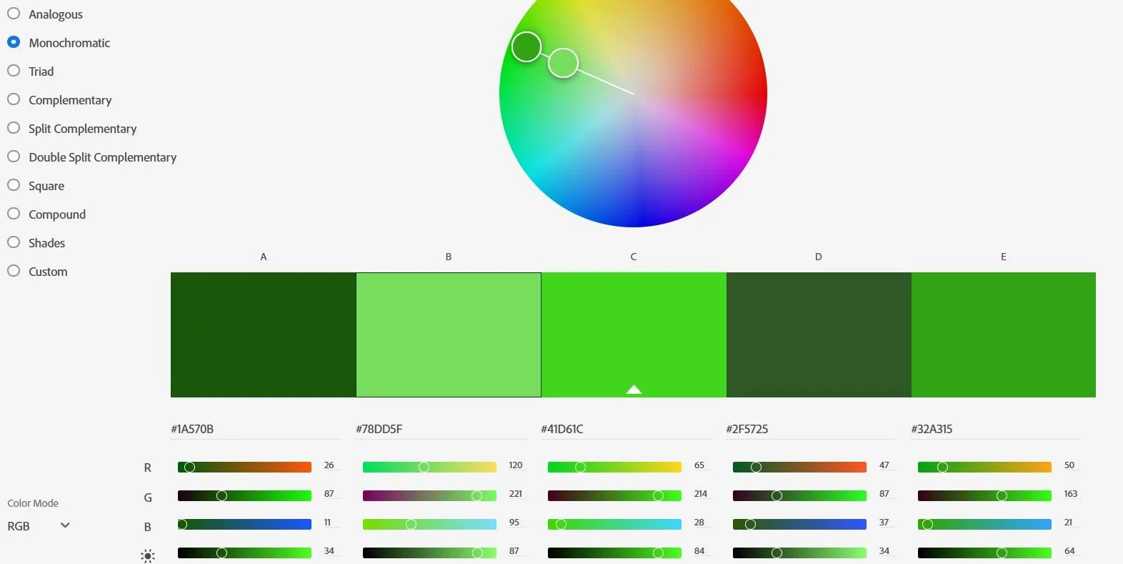
11 - Monochromatic
This week we will look at the Monochromatic Colour palette. This palette is built around similar blends based on one colour. On the colour wheel, a monochromatic colour palette will form a straight line from the centre to the edge.


The Matrix is an classic example of the use of a monochromatic colour palette.


Mono
We have covered a few palettes now so I think it is worth doing a quick comparison.
Note how Monochromatic is different from Analogous. Displayed on the colour wheel a Monochromatic palette selects colours along a straight chord whilst Analogous grabs colours from an arc.
Shades is a more strict colour palette that consists of one primary colour with the rest of the palette made from the same colour but with different luminance (brightness) values.

Chromatic
For this week's assignment:
Compose a photo with a monochromatic colour scheme.
Before you shoot: a subject with a uniform colour being illuminated by a strong light source (preferably by the sun) will usually display a nice monochromatic palette. For example, a rustic brick wall or leaves from a tree. Remember that white and black are not colours in a photographic sense and can be included in your composition, but don't let them dominate the image. Be bold with your colours!
Good to know: A monochromatic palette can be used to make the best of bad weather. For example a hazy sunset can look more powerful if converted to a monochromatic.
Reading Material:
https://iceland-photo-tours.com/articles/photography-techniques/15-tips-for-monochrome-photography
https://expertphotography.com/monochromatic-color
https://digital-photography-school.com/use-monochrome-color-photography
10 - Complementary
This week we will look at the Complementary Colour palette. This colour palette consists of colours from opposing sides of the colour wheel. Maybe "Contrasting" might have been a more appropriate name choice than the slightly misleading sounding "Complementary"?
That Hollywood Look
The Complementary Colour palette is a popular choice with graphic designers and colourists as it can introduce a lot of contrast to an image.
A commonly used method look in movies is the orange-teal palette, sometimes referred to as the "Hollywood look". In this colour palette highlights and important areas (such as skin tones) are graded with a slight orange hue whilst shadows and background elements are graded with a blue hue. This contrast in colours allows for important areas to become more noticeable.


For this week's assignment:
Compose a photo with a complementary colour scheme.
Before you shoot: turning your camera into vivid may help exaggerate your colours.
Reading Material:
https://digital-photography-school.com/stylize-images-using-complementary-colors-lightroom
http://www.adeepoberoi.com/blockbuster-color-grading-palette

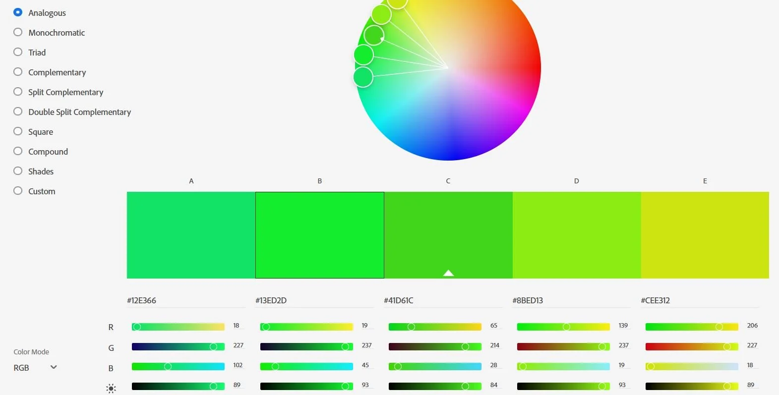
09 - Analogous
Last week we begun looking at colour theory and how various colours taken from the colour wheel can be combined to form colour palettes.
This week we will focus on the Analogous Colour Palette (adjacent colours).
Won't You Be My Neighbor?
Here are some examples of Analogous palettes I made with the Adobe colour wheel.


For this week's assignment: Compose a photo with an analogous colour palette.
Before you shoot:
Sunrises and sunsets are often good examples of natural analogous colour palettes. Green and yellow are also analogous colours.
Hint:
The hue editor under color > hue/saturation may be useful if you are unable to find an analogous colour palette.


08 - Colour
Good job on completing the first semester of The 52! In this next semester, we will look into Colour Theory. You can now shoot again in colour, although you won’t need your camera for this first assignment.
The Colour Wheel
Before we begin discussing colours and how to use them we should become familiar with the colour wheel. The colour wheel is a great visual representation of the entire colour palette available to you as a creative.
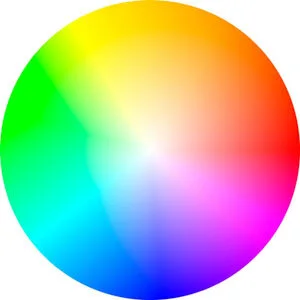
All colour schemes used to stylise an image are individual segments taken from the colour wheel and combined in different ways.
Below is a list of some common colour schemes:
Analogous - adjacent colours
Complementary - opposite colours
Monochromatic - one colour with varying amounts of saturation
Split-Complementary - one base colour vs two base colours that are adjacent to the base colour complementary
Triad - three base colours that are evenly spaced
Square / Rectangular - four base colours that are evenly spaced (square) or adjacent to a complementary pair (rectangular)
It can be tricky to describe colours and colour schemes in words, so I recommend you have a quick read of these articles before proceeding.
https://drawpaintacademy.com/color-schemes/
https://medium.com/@pixelmagazine/color-theory-for-photographers-an-introduction-ae23296fda6d
https://iso.500px.com/color-theory-photographers-introduction-color-wheel/
Palette cleanser
To have an appreciation of the colour wheel is a good start, but for practical use colour palettes need to be extracted from the colour wheel so they can be used as a template for your creative project.
Adobe has an online interactive colour wheel that can be used for that exact purpose. The link can be found here:
https://color.adobe.com/create/color-wheel
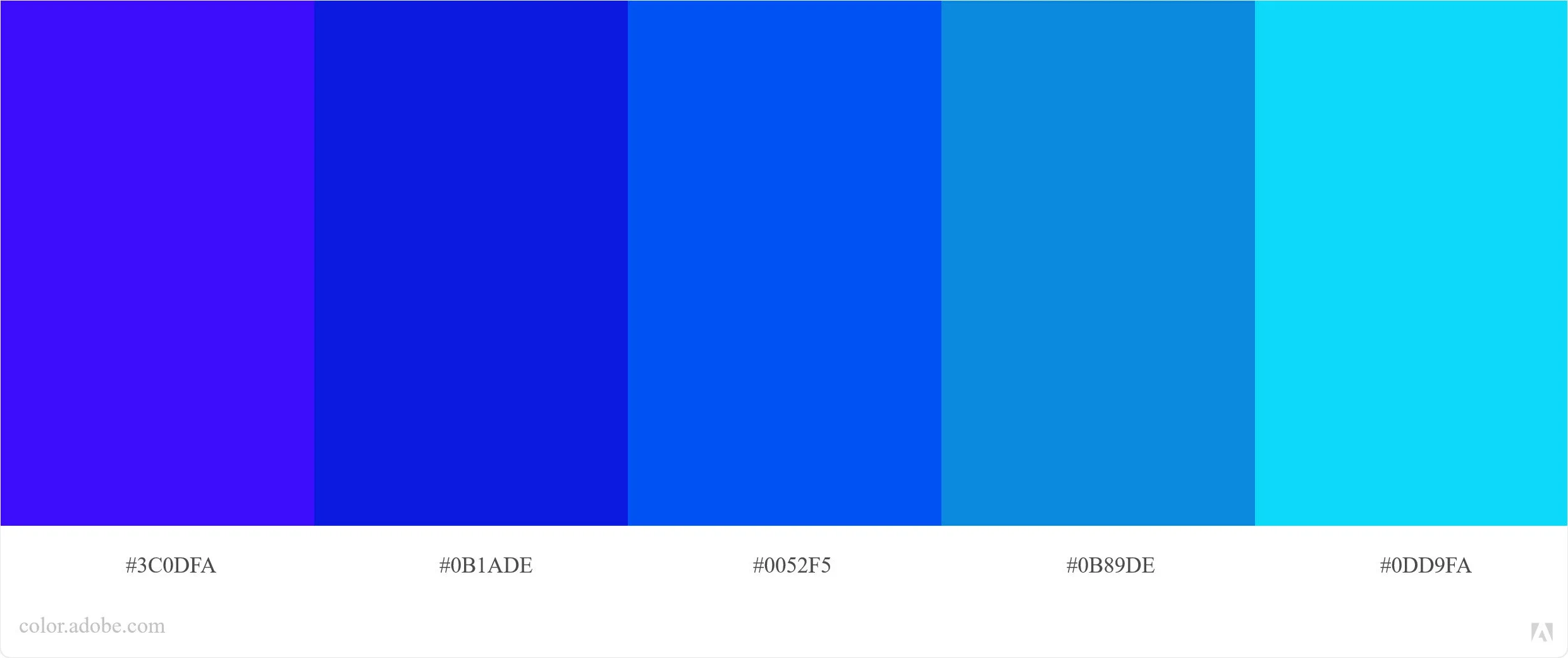
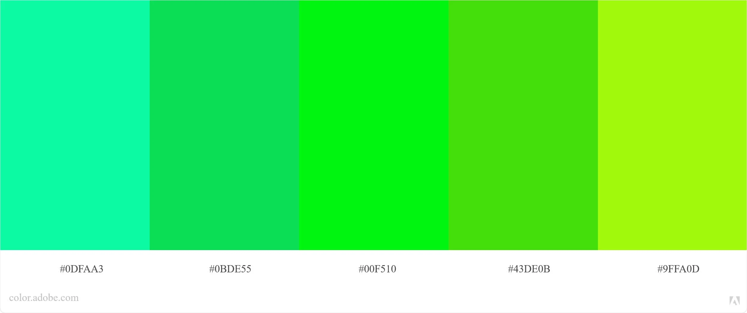
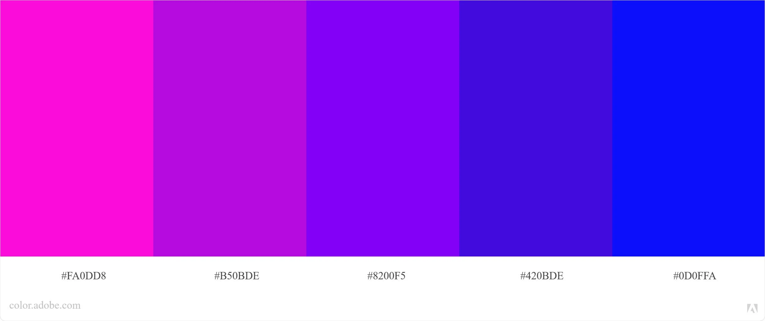
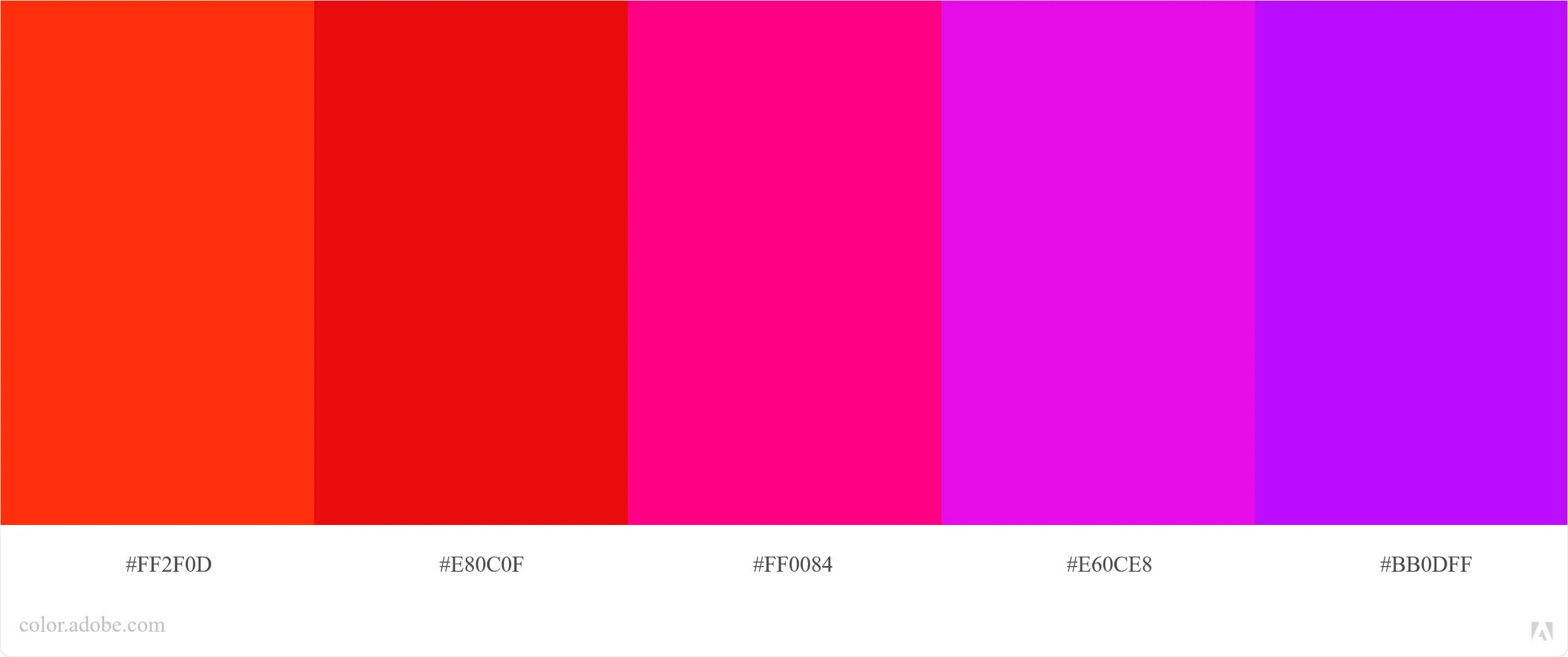
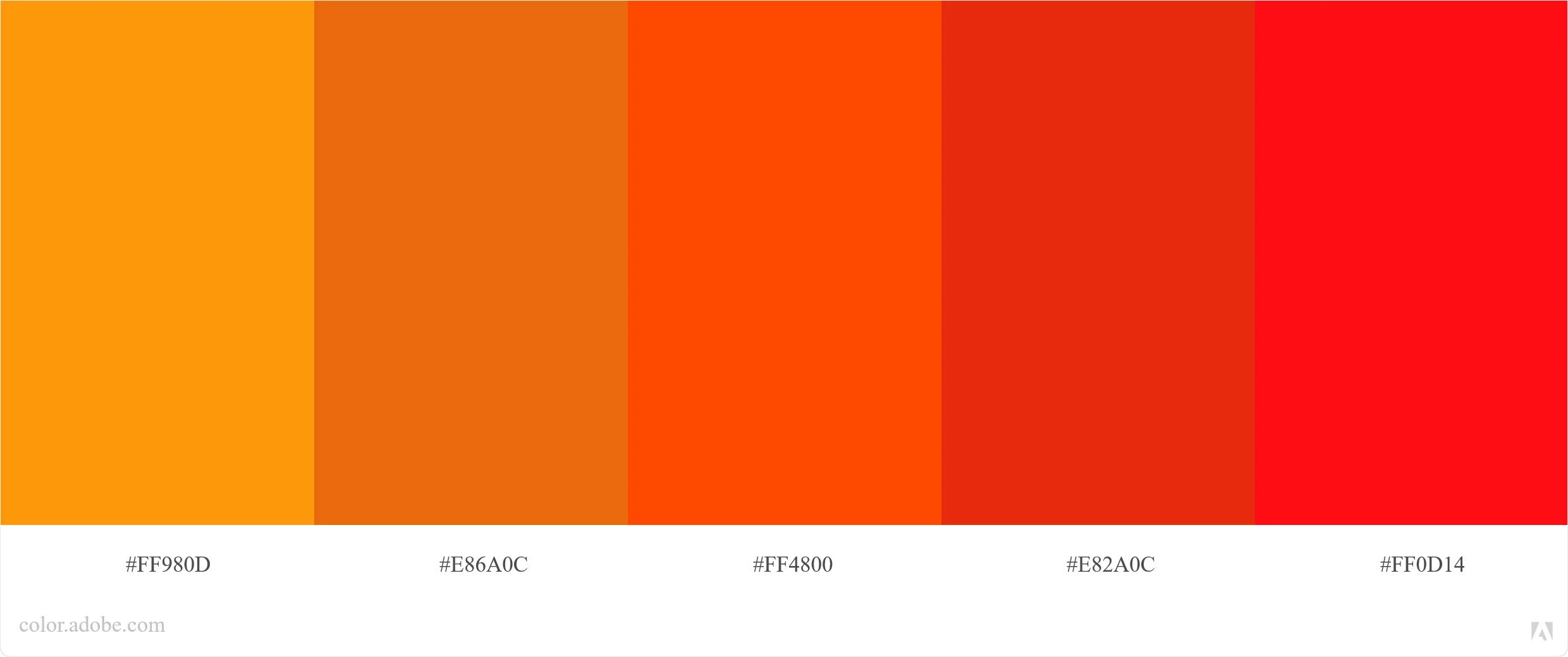
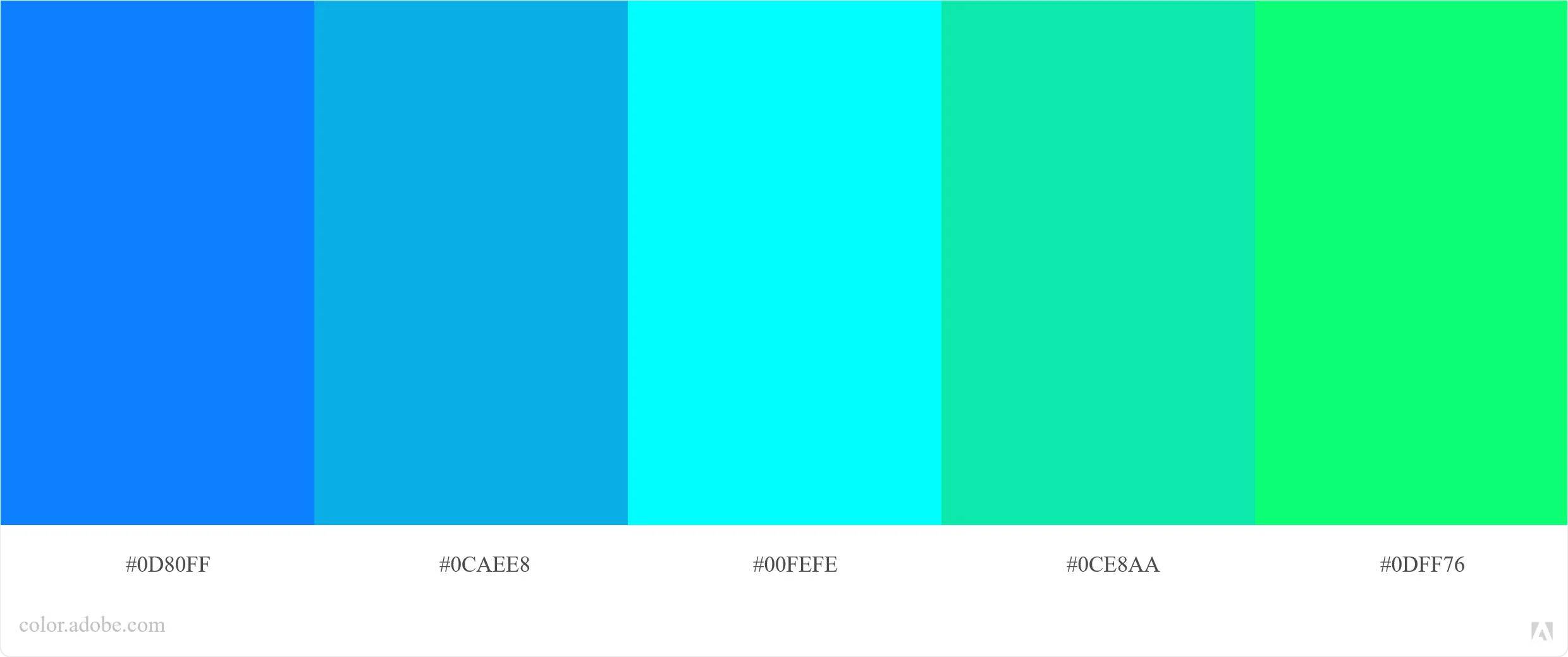
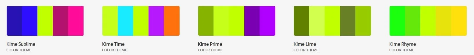
As an example, I have taken the famous "Kime Lime" colour and made my own palettes using the colour wheel and schemes mentioned above.

Kime Lime - base colour #BFFF00 added into colour C (base colour)
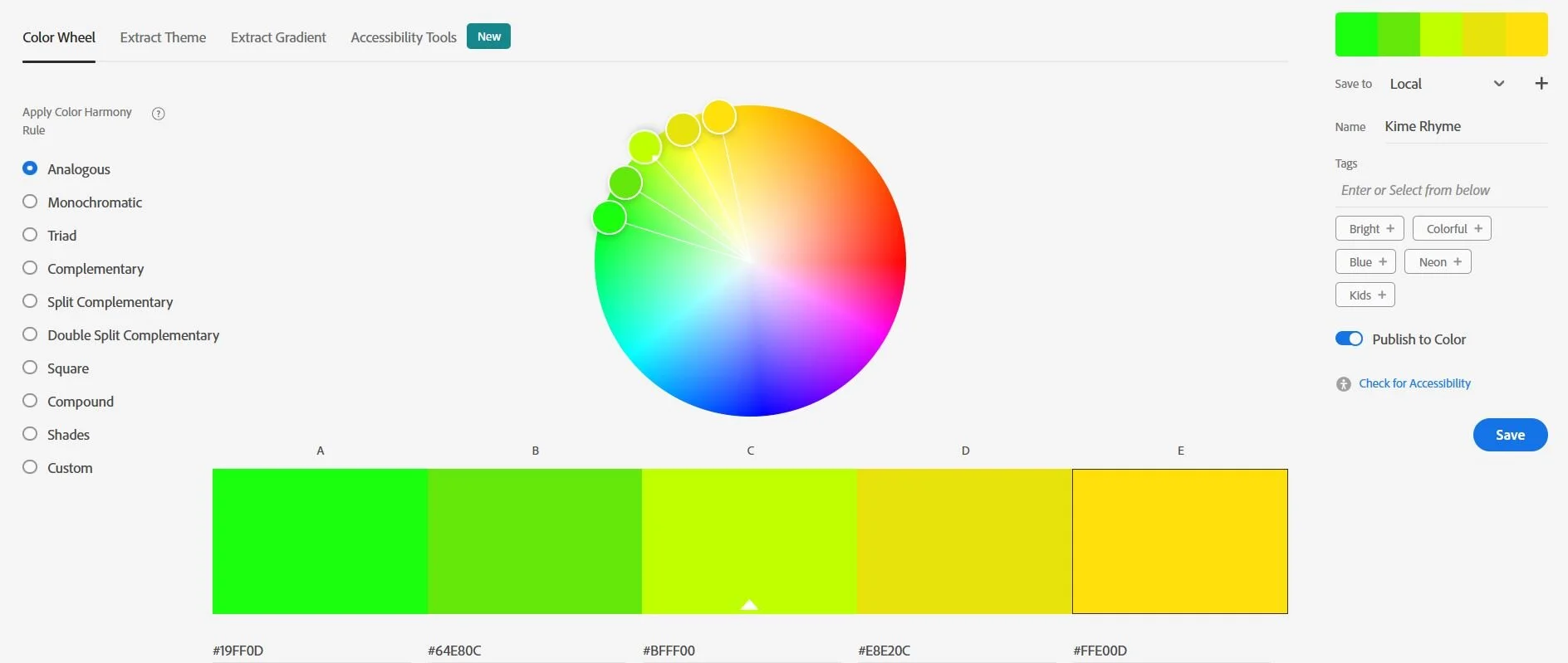
Kime Rhyme - Lime with Analogous scheme.

Kime Prime - Lime with Complementary scheme

Kime Time - Lime with Square scheme
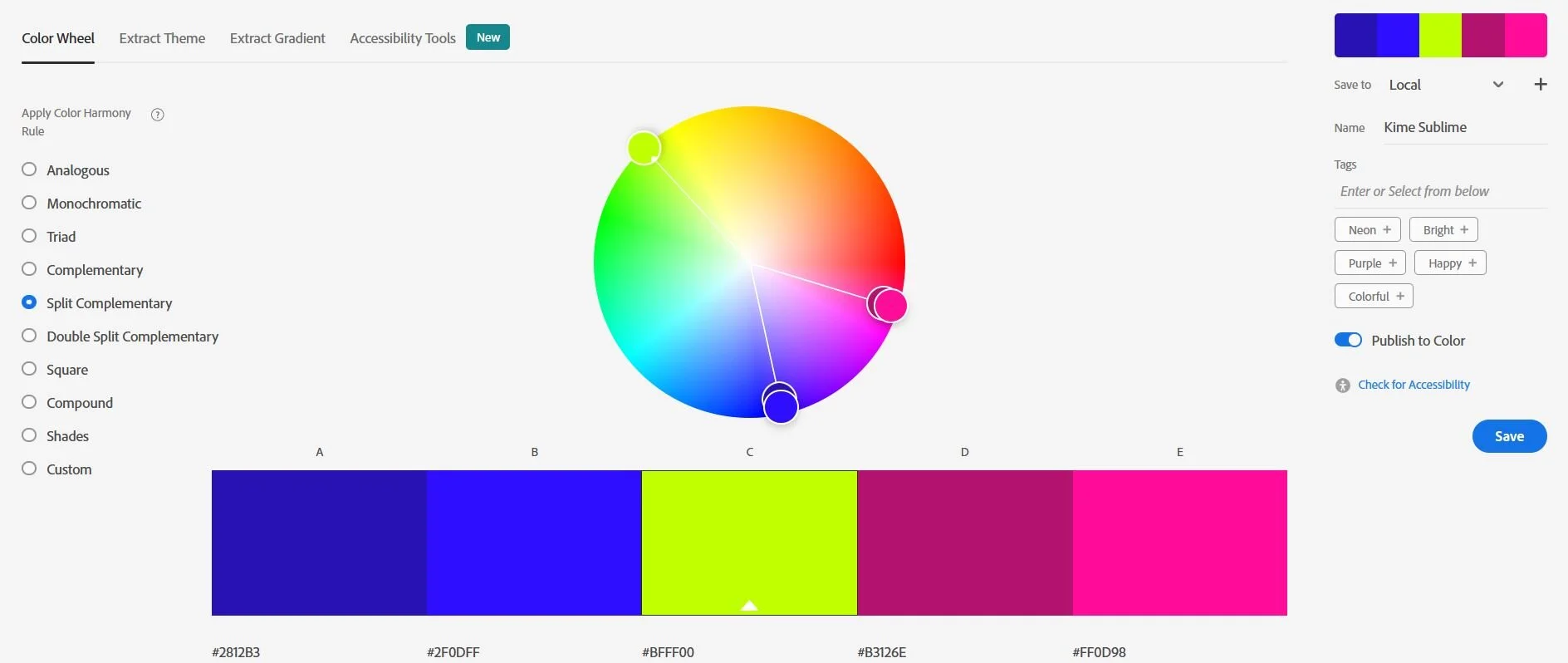
Kime Sublime - Lime with Split Complementary scheme

Kime Crime - Lime with Triad scheme
The Kime Kollection
For this week's assignment: make a colour palette for each member of MWMD+S
Pick a base colour that you think matches each member of MWMD+S
Design a colour palette using the Adobe colour wheel based on each base colour and make a colour palette that best represents each person
Present these colour palettes to the group via Whatsapp without any prior explanation
Ask the group to vote on which colour palette they believe best matches each person
You will be rated based on the number of correct guesses
Before you pick:
Make sure you are comfortable with using the Adobe Color wheel. Ask me any questions if you are unsure.
Hint:
Have fun.
Reading Material:
https://drawpaintacademy.com/color-schemes/
https://medium.com/@pixelmagazine/color-theory-for-photographers-an-introduction-ae23296fda6d
https://iso.500px.com/color-theory-photographers-introduction-color-wheel/
05 - Vanishing Point
The paths we take
A photo will take your eyes on a journey, a good photo will have a predefined path for your eyes to follow on their journey. A path that will usually begin at the edge and leads to the subject of the image.
This path can be obvious like a river bend sweeping through a canyon, or a subtle dust path leading over a hill. Whether the path is large or small, they are usually made from one or more sets of lines. We refer to these lines as the "leading lines".
Leading lines can lead to two destinations.
A clear, well defined subject. Usually the main subject of the image.
No subject, the lines will lead off until they converge at a single point.
Vanishing Point
We will focus on the "no subject" leading lines for this assignment.
Leading lines that have no subject will converge into a single point point if they are not interrupted, this point becomes the subject. We call this point the “Vanishing Point”
For this week's assignment: compose an image with a vanishing point.
Before you shoot:
Railway lines are commonly used as a compositional element to create leading lines. However, there overuse has made them become cliche. Stories of railway accidents caused by photo shoots on live tracks has also made the use of this photography element generally frowned upon by the photographic world. Try to avoid using railway tracks in this assignment. If you are out of struggling to find other leading lines, try revisiting our first assignment on Lines in there most basic form. A refresh on this assignment might help tune your photographic eye again to spot lines before taking this assignment.
Hint: get down low. You may find leading lines easier to spot if you shoot from a lower angle
Reading Material: https://expertphotography.com/vanishing-points-composition/


06 - Leading lines
The main subject in a photo should be easily accessible to the eye of the viewer. Leading lines, whether strong or subtle, will help the viewer reach the subject without getting lost.
An easier to reach subject can make that subject much stronger without having to dominate the image.
For this week's assignment: compose an image with leading lines that lead to a subject. The subject must be clearly defined and not ambiguous.
Before you shoot:
As before, avoid using the cliché railway scene.
Hint:
Leading lines can be both horizontal and vertical. Leaning the camera against a wall may help introduce leading lines into your composition.
Reading Material:
https://www.format.com/magazine/resources/photography/leading-lines-photography
https://petapixel.com/2021/01/20/leading-lines-in-photography/


07 - Tones
A game of Tones
If you remove all the details from a photo (lines, shapes and textures) you will be left with tones, areas of dark and light and all shades in between. This is also referred to as contrast. An image that uses the full tonal range is said to have a high level of contrast and can be described as "punchy" whereas, an image lacking contrast may be described as faded and "dreamy".
The punchy advocate
It is impossible to talk about tones and contrast without discussing the famous photography pioneer Ansel Adams. He, along with Fred Archer, developed the zone system. A framework on what elements of a photograph should fall into each tonal range. A tone bible.

Ansel Adams was also an advocate of environmental conservation and his work helped with the protection and expansion of the national parks in the US. If you look at some of his photography work you will notice the high level of contrast and the full use of the tonal range. Consider this; do you think his photos would have been this famous had he not used the full tonal range? You could even argue that the US would have smaller and fewer national parks had his photography been less punchy.
For this week's assignment: compose a photo that covers the full range on the tonal scale. Try your best to follow the Ansel Adam zone system. Think; what would Ansel Adams do?
Before you shoot:
Read this article written by f-stoppers on the Ansel Adams zone.
https://fstoppers.com/education/how-use-ansel-adams-zone-system-digital-world-417047
Also, try and turn on your camera's histogram for this assignment. This will give you a live preview of the tonal scale of your photo.

04 - Rhythm and repetition
the silent music
Our minds seek order. We find order comforting and enjoyable. This is why we enjoy music.
Music is a series of basic sounds arranged into a predictable repeating pattern and we call this pattern "rhythm". Our mind's ear enjoys music with rhythm because it has order.
Our mind's eye also has a preference for order over chaos. We find repeating patterns more enjoyable to view compared to chaos.
In some ways composing a photo is similar to composing a piece of music. The photographer takes basic elements, repeats them in a predictable pattern and adds them into the frame of their photo.
For this week's assignment: compose a photo with the focus on a basic element that repeats. Look for repeating lines or shapes, or both. Repeating patterns can be both linear and circular.
Before you shoot:
Our preference for order is why you may often see fences used as an element in photos, particularly in landscape and portrait photography. Fences are orderly and predictable and can bring rhythm to a composition that would otherwise be chaotic.


03 - Texture
The Dark Light
Can you feel an image? Absolutely. Some of the most powerful and alluring images are the ones you can feel as well as see.
For this week's assignment: focus on texture. It can either be a photo with a variety of many textures, or just a focus on one particular texture.


Before you shoot:
Consider the story of Brenden Borellini, the recipient of “Yound Australian of the Year” award. He was born both blind and death but this did not stop him from pursuing an interest in photography. An art studio made a special topographical printer that prints his images as 3D impressions. This allows Brenden to “see” his images by running his hands over the printed canvas and feel the textures.
When you go out and shoot for this week's assignment think about how your image would feel if it was printed on Brenden's printer.
02 - Shapes
The shape of you
Following on from lines the second most fundamental element of a photo is shapes. Lines converge to form closed shapes and these shapes are the building blocks of your photo.
For this week's assignment: take photos with shapes as the main focus.
Before you shoot:
Try hard to see the world entirely in shape form. Notice how everything we see is just an arrangement of various shapes.
In the film “The Matrix” anyone who views the matrix from the outside can only see green cascading text. Eventually the viewer can only see a three dimensional image made from the text. Learning to see the world in shape form is the same process in reverse. It is training the eye to see the basic shapes (or code) that makes up the world.

01 - Lines
Before you begin, turn your camera's picture profile into black and white. You won't be needing colour for a while. Colour can be distracting when trying to learn the fundamentals of photography.
Walk the Line
Lines are the most basic element of any photo. Many lines come together to form shapes, patterns and textures. Learning to see the world in line-form can really help you develop your photographic eye.
This week's assignment: take photos of lines. Make lines the subject and focus of your image.
